Code
box::use(
    arm
)box::use(
arm
)The folder pyth contains outcome \(y\) and inputs \(x_1, x_2\) for \(40\) data points, with a further \(20\) points with the inputs but no observed outcome. Save the file to your working directory and read it into R using the read.table() function.
Well, my first problem here was that I downloaded the data from the textbook website and the pyth folder wasn’t in there. It’s on the website, just not in the zip folder. Anyways.
pyth <- read.table(
    here::here("arm", "data", "pyth", "exercise2.1.dat"),
    header = TRUE
)

# Get only data with observed outcomes
pyth_obs <- pyth[1:40, ]

# Get only data with unobserved outcomes
pyth_unobs <- pyth[41:60, ]
- Use
Rto fit a linear regression model predicting \(y\) from \(x_1, x_2,\) using the first \(40\) data points in the file. Summarize the inferences and check the fit of your model.
fit_q1a <- lm(y ~ x1 + x2, data = pyth_obs)
arm::display(fit_q1a)
lm(formula = y ~ x1 + x2, data = pyth_obs)
coef.est coef.se
(Intercept) 1.32 0.39
x1 0.51 0.05
x2 0.81 0.02
---
n = 40, k = 3
residual sd = 0.90, R-Squared = 0.97From the model output, it looks like all of the coefficients should be statistically significant (at a \(0.05\) significance level). The \(R^2\) indicates that the model fits quite well. The mean of the observed \(y\) values is \(\bar{y} = 13.59\), which is quite large compared to the residual SD of \(0.9\), so the model fits the data quite well.
- Display the estimated model graphically as in Figure 3.2.
set.seed(370)
beta_hat <- coef(fit_q1a)
beta_sim <- arm::sim(fit_q1a)@coef
layout(matrix(c(1, 2), nrow = 1))
plot(
    pyth_obs$x1, pyth_obs$y,
    xlab = "x1", ylab = "y"
)
for (i in 1:100) {
    curve(
        cbind(1, x, mean(pyth_obs$x2)) %*% beta_sim[i, ],
        lwd = 0.5, col = adjustcolor("gray", alpha.f = 0.5),
        add = TRUE, n = 1000L
    )
}
curve(
    cbind(1, x, mean(pyth_obs$x2)) %*% beta_hat,
    lwd = 1, col = "black",
    add = TRUE, n = 1000L
)

plot(
    pyth_obs$x2, pyth_obs$y,
    xlab = "x2", ylab = "y"
)
for (i in 1:100) {
    curve(
        cbind(1, mean(pyth_obs$x1), x) %*% beta_sim[i, ],
        lwd = 0.5, col = adjustcolor("gray", alpha.f = 0.5),
        add = TRUE, n = 1000L
    )
}
curve(
    cbind(1, mean(pyth_obs$x1), x) %*% beta_hat,
    lwd = 1, col = "black",
    add = TRUE, n = 1000L
)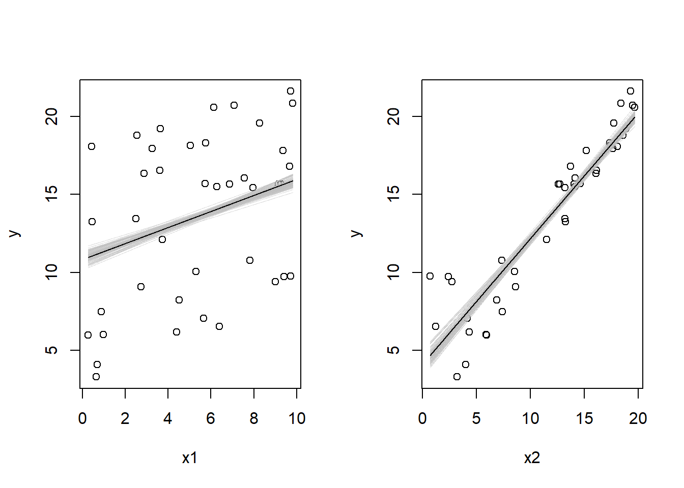
layout(1)
- Make a residual plot for this model. Do the assumptions appear to be met?
plot(
    fitted.values(fit_q1a), residuals(fit_q1a),
    xlab = "Fitted values", ylab = "Residuals",
    ylim = c(-3, 3)
)
abline(h = 0, lty = 2)
abline(h = arm::sigma.hat(fit_q1a), col = "darkgray", lty = 3)
abline(h = -arm::sigma.hat(fit_q1a), col = "darkgray", lty = 3)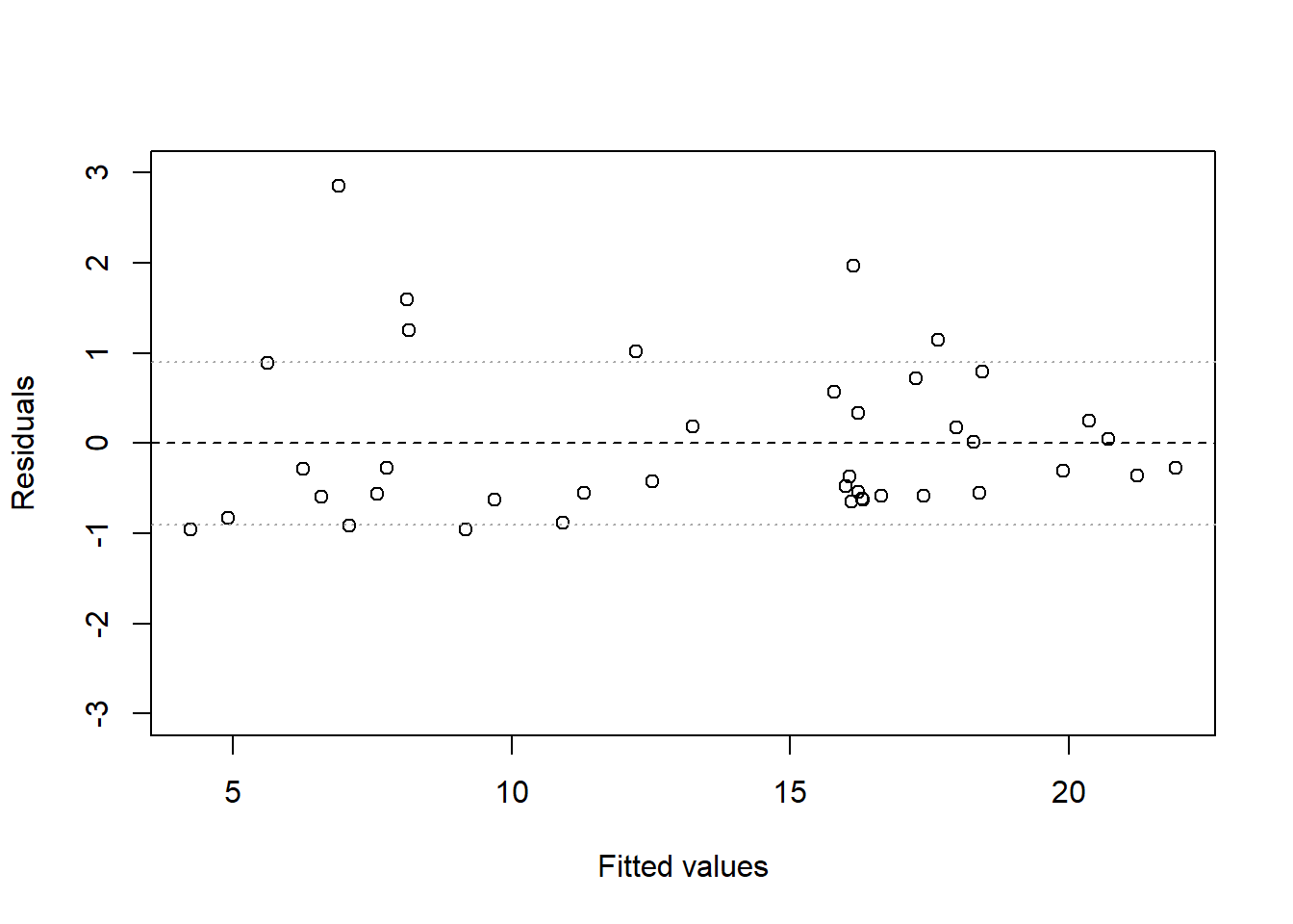
The residuals are clearly not evenly distributed above and below 0, as they should be. It appears that underpredictions are typically less bad than overpredictions are, which indicates that perhaps either additivity, linearity, or equal variance are violated.
- Make predictions for the remaining 20 data points in the file. How confident do you feel about these predictions?
layout(matrix(c(1, 2), nrow = 1))
pyth_pred <- predict(fit_q1a, newdata = pyth_unobs, interval = "prediction")
# X1 plot
plot(
    NULL, NULL,
    xlim = c(0, 10), ylim = c(3, 22),
    xlab = "x1", ylab = "y"
)
points(
    pyth_obs$x1, pyth_obs$y,
    pch = 1, col = "black"
)
segments(
    pyth_unobs$x1,
    pyth_pred[, 2],
    pyth_unobs$x1,
    pyth_pred[, 3],
    col = "firebrick4"
)
points(
    pyth_unobs$x1, pyth_pred[, 1],
    pch = 21, col = "firebrick4", bg = "white"
)
for (i in 1:100) {
    curve(
        cbind(1, x, mean(pyth_obs$x2)) %*% beta_sim[i, ],
        lwd = 0.5, col = adjustcolor("gray", alpha.f = 0.5),
        add = TRUE, n = 1000L
    )
}
curve(
    cbind(1, x, mean(pyth_obs$x2)) %*% beta_hat,
    lwd = 1, col = "black",
    add = TRUE, n = 1000L
)

# x2 plot
plot(
    NULL, NULL,
    xlim = c(0, 20), ylim = c(3, 22),
    xlab = "x2", ylab = "y"
)
points(
    pyth_obs$x2, pyth_obs$y,
    pch = 1, col = "black"
)
segments(
    pyth_unobs$x2,
    pyth_pred[, 2],
    pyth_unobs$x2,
    pyth_pred[, 3],
    col = "firebrick4"
)
points(
    pyth_unobs$x2, pyth_pred[, 1],
    pch = 21, col = "firebrick4", bg = "white"
)
for (i in 1:100) {
    curve(
        cbind(1, mean(pyth_obs$x1), x) %*% beta_sim[i, ],
        lwd = 0.5, col = adjustcolor("gray", alpha.f = 0.5),
        add = TRUE, n = 1000L
    )
}
curve(
    cbind(1, mean(pyth_obs$x1), x) %*% beta_hat,
    lwd = 1, col = "black",
    add = TRUE, n = 1000L
)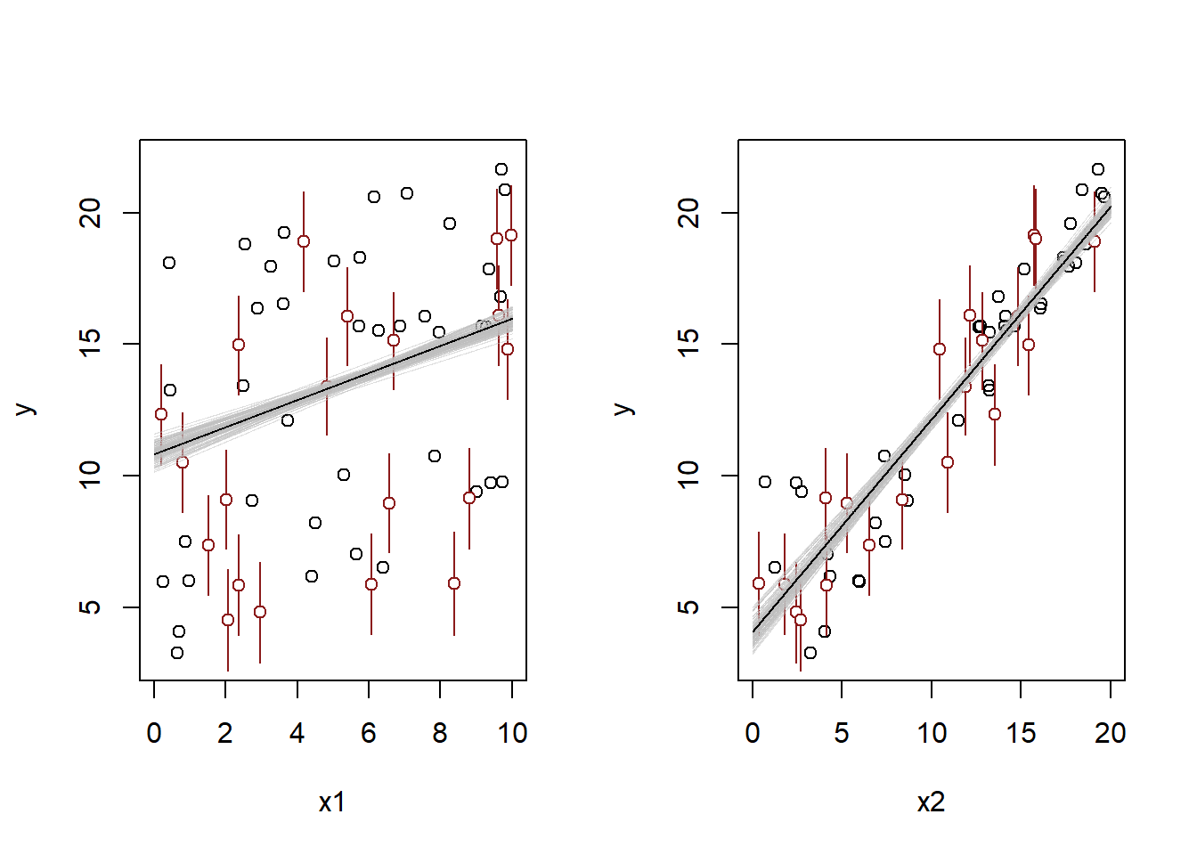
From the plot, we can see that the new predictions are fairly similar to the original data, and none of them look crazy. So given the good diagnostics, these predictions are probably OK – as long as we assume that they came from the same data-generating process as the observed outcomes. Fixing the issue that causes the somewhat strange residuals might give us some more peace of mind though.
Suppose that, for a certain population, we can predict log earnings from log height as follows:
- Give the equation of the regression line and the residual standard deviation of the regression.
We know that the regression line is of the form
\[ \begin{aligned} \log y &= \hat{\alpha} + \hat{\beta} \log x \\ y &= e^{\hat{\alpha} + \hat{\beta} \log x} \\ y &= e^{\hat{\alpha}}x^{\hat{\beta}}. \end{aligned} \]
From the second bullet point, we get that
\[1.008y = e^{\hat{\alpha}}(1.01x)^{\hat{\beta}}.\]
Dividing by the original equation, we get that \[ \frac{1.008y}{y} = \frac{e^{\hat{\alpha}}(1.01x)^{\hat{\beta}}}{e^{\hat{\alpha}}(x)^{\hat{\beta}}} = \left( \frac{1.01x}{x} \right)^{\hat{\beta}} \implies 1.008 = 1.01^{\hat{\beta}}. \]
Solving, we get that \[\hat{\beta} = \frac{\log 1.008}{\log 1.01} \approx 0.8.\]
Note that we could have just used this approximation in the first place – the percent change will be approximately close to \(\hat{\beta}\) for small percent changes. Anyways, now we can solve for \(\hat{\alpha}\) using the information from the first bullet point:
\[ 30000 = e^{\hat{\alpha}}\times66^{0.8} \implies \hat{\alpha} = \log\left(\frac{30000}{66^{0.8}}\right) \approx 6.96. \]
So our regression line is approximately \[ y = e^{6.96}x^{0.8}. \]
To get the value of \(\hat{\sigma}\), we need to use the information from the third bullet point. We get that \(95\%\) of outcomes are within a factor of \(1.1\), which implies that for \(95\%\) of people, their log predicted outcome is \(\log(1.1)\) away from their true value. Since we assume anormal distribution, that means that \(95\%\) of people have predicted outcomes within approximately \(2\hat{\sigma}\) of their true outcomes, so we get that \[ \hat{\sigma} \approx \frac{\log 1.1}{2} \approx 0.048. \]
- Suppose the standard deviation of log heights is \(5\%\) in this population. What, then, is the \(R^2\) of the regression model described here?
I’m not really sure how to get the standard deviation from the description “the standard deviation is \(5\%\) in this population.” Five percent of what? Of the mean? We don’t have that. It also says “the standard deviation of heights.” So if we knew the correlation coefficient, we could use that to get the standard deviation of the earnings. But there’s nothing really tractable here because we’re missing too much information. So I think we have to assume that the standard deviation of the log earnings is \(0.05\).
Once we make that assumption, the \(R^2\) is calculated as follows.
\[ \begin{aligned} R^2 &= 1 - \frac{\hat{\sigma}^2}{s_y^2} \\ &= 1 - \frac{0.048^2}{0.05^2} \\ &\approx 0.08. \end{aligned} \]